
6. FlexBox:
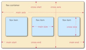
Flexbox Elements: To start using the Flexbox model, you need to first define a flex container. The flex container becomes flexible by setting the display property to flex. The flex container properties are:
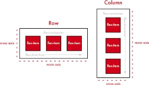
- flex-direction(the direction the container wants to stack the flex items.)
- flex-wrap(specifies whether the flex items should wrap or not.)
- flex-flow(setting both the flex-direction and flex-wrap properties.)
- justify-content(to align the flex items.)
- align-items(to align the flex items.)
- align-content(used to align the flex lines.)
7. GRID:
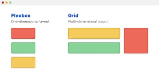
Grid Elements: A grid layout consists of a parent element, with one or more child elements. An HTML element becomes a grid container when its display property is set to grid or inline grid. Example: .grid-container { display: grid;} example ends.
Grid Columns(vertical lines of grid items)
Grid Rows(horizontal lines of grid items)
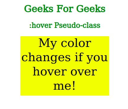
8. Pseudo Classes:
A pseudo-class is used to define a special state of an element.
For example, it can be used to:
- Style an element when a user mouses over it.
- Style visited and unvisited links differently.
- Style an element when it gets focused.
Anchor Pseudo-classes: Links can be displayed in different ways: Example:
unvisited link a:link {color: #FF0000;} visited link a:visited {color: #00FF00;}
mouse over link a:hover {color: #FF00FF;} selected link a:active {color: #0000FF;}
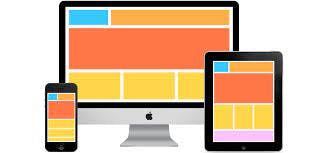
9. Responsive Designs:
There are many free CSS Frameworks that offer Responsive Design. Using W3.CSS A great way to create a responsive design is to use a responsive style sheet, like W3.CSS
W3.CSS makes it easy to develop sites that look nice at any size!
10. CSS3 Media Types:
- all(Used for all media type devices.)
- print(Used for printers.)
- screen(Used for computer screens, tablets, smartphones, etc.)
- speech(Used for screenreaders that "reads" the page out loud.)
11. Animations:
- keyframes-(Specifies the animation code).
- animation-(delay for the start of an animation).
- animation-direction(Specifies direction forward etc).
- animation-duration(Specifies time).
- animation-fill-mode(Specifies a style for the element (before starting after ending of animation or both).
- animation-iteration-count (Specifies the number of times an animation should be played).
12. Preprocessors:
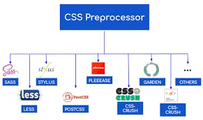
CSS Preprocessors compile the code which is written using a special compiler. They then use that to create a CSS file, which can then be referenced by the main HTML document.
When using any CSS Preprocessor, you will be able to program in normal CSS just as you would if the preprocessor were not in place. The good thing is you also have more options available to you. Some, such as SASS, have specific style standards which are meant to make the writing of the document even easier, such as the freedom to omit braces if you want.
NOTE: This blog was written by me information is collected from different sources and some information is added by me and I have compiled it into a blog for you.Thanku!